Crafting of Battle Aces 2024-07 report
Thoughts behind the report and annoyances with the data I had to deal with.
This post references Battle Aces July 2024 Playtest 1v1 Observations.
Intro
Battle Aces, one of the upcoming RTS games, had a playtest in July 2024. The core concept of the game is having a customizable deck of units rather than individual ingame factions with different units. This "deck-building" concept is a fresh idea and I wanted to explore how it plays out based on the data the developers provided.
Data
The only data provided was a leaderboard of players with the best attainable rank (Top Ace). Each record consisted of:
- Rank
- Rating
- Player name
- Last used deck (array of unit codes)
There was a leaderboard for each of the 1v1 and 2v2 modes. I only focused on the 1v1 mode since it has been the more popular mode during playtest (786, 86 Top Ace members in 1v1, 2v2 respectively).
Data annoyances
Crafting insights from the data was a bit tricky. Contrary to other RTS games, there was no info about number of games played or win record, so I had to detect activity based on rating changes, which in some cases is not reliable (e.g. player with 1-1 record in the session leaving them on the same rating).
Data had a 1 hour cache, so that was the lowest granularity I could get. I had a cron job to fetch the data every hour, but for some reason the data was sometimes still outdated and I did not notice it until it was too late. So the realistic granularity was 2 hours.
I assumed the last used deck has been actually played, but I think players might have actually just changed the deck in menu without playing any game with that. There is also issue with the deck being shared between the game modes.
Some players shared the same name, so I had to somehow differentiate them. I used their relative rank, but in theory this could have generated false activity if the players were close to each other.
Data processing
I opted to load the data into DuckDB and do the analytics queries with SQL, mainly due to already having some snippets that could be reused. However, due to low data complexity and basically using a single primary table, it could very well be done just with Python and Pandas.
The only noteworthy preprocessing step was discriminating the players with the same name. I used the natural order they come in and add a numerical suffix to the name in case of duplicates.
def make_unique(names):
    counts = {}
    unique_names = []
    for name in names:
        if name in counts:
            counts[name] += 1
            unique_names.append(f"{name} ({counts[name]})")
        else:
            counts[name] = 1
            unique_names.append(name)
    return unique_names
This would convert ["Barcode", "Keiras", "Barcode", "Lyrk", "Barcode"] to ["Barcode", "Keiras", "Barcode (2)", "Lyrk", "Barcode (3)"] and make it the key attribute. The data are provided as a single JSONArray ordered by rank, so this covers most of the cases as noted above. Cases not covered are:
- Players with the same name overtaking each other in the leaderboard - no way to identify this, since there are no unique identifiers in the data and the only stat I have is the rating that can greatly fluctuate. In theory, I might try to do some deck similarity metric and try to label the players based on that, but since people changed the deck quite often based on meta, this would intuitively mess up the data even more.
- Players changing names - I am not sure if the game actually updates the Steam name in the leaderboard (it was not the case in SG alpha and beta tests for example). If it does, I would lose the track of the player between timepoints. Since no player can get removed from Top Aces, I could try detecting which names disappeared between timepoints and match them with the new ones appearing. I decided to ignore this instead since I estimated this to be marginal issue in the context of the intended analytics.
Analysis
I've crafted three analytics items:
- Population overview - as usual in such reports, I tried to provide some sort of insight on the popularity of the game throughout the playtest.
- Unit pick rates - in deck-building games, the unit pick rates over time can give a good insight on the meta and strength of the units.
- Double tier 3 unit picks - the way deck-building works, players have a wildcard slot for "ground" and for an "air" unit. It might be interesting to see, if players opted to choose a lower or higher tech tier unit in this slot.
Population overview
To showcase the size of game population, I went with two metrics:
- Number of players in Top Ace
- Number of daily active players in Top Ace
Queries
Due to limitations in the data source, I could only work with players in the top league. I estimate it takes 6-10 hours to reach the league, so not all the accounts are included. Anecdotally, I know plenty of players that did not reach the league because of limited time, lack of interest or simply not being good enough.
Daily active player is a metric I have used before for Stormgate, Starcraft II and Age of Empires IV, so it could provide some context for the game's popularity. I believe it is a pretty good metric for multiplayer games as the usual goal is to make players play some games every day.
Calculating number of players in the league on a given day was pretty straightforward, since I have loaded all the timepointed data into the database. I count the player records by timepoint and later on look for the maximum on a given day.
SELECT datetrunc('day',timestamp) AS date, MAX(c) as players,
FROM(
    SELECT timestamp, count(*) as c
    FROM leaderboard1v1
    WHERE timestamp < '2024-07-16'
    GROUP BY timestamp
)
GROUP BY 1
ORDER BY 1
;
※ Note that I had a spell of lack of naming imagination and went with timestamp as the column name even though it is a reserved keyword in SQL 🙃, so the code highlighting is a bit messy.
Active players query is a bit more interesting. I decided to detect activity by observing a rating change in a consecutive (hourly) timepoints. As mentioned above, this is not foolproof, but detecting activity based on deck change would have been even more reliable (since players does not need to change decks that often) and I saw no other option.
I've made a CTE to filter active records - those that have a change compared to the previous timepoint - utilizing the LAG window function. Since players can play session spanning multiple timepoints, I used DISTINCT to count the players only once per day.
WITH dat AS(
SELECT name, datetrunc('day',timestamp) AS date
    FROM(
        SELECT name, timestamp,
            (LAG(rating, 1)OVER(PARTITION BY name ORDER BY timestamp) - rating <> 0) AS active
        FROM leaderboard1v1
        ORDER BY timestamp
    )
    WHERE active = TRUE
    AND timestamp < '2024-07-16'
)
SELECT date, COUNT(DISTINCT name) as count
FROM dat
GROUP BY date
ORDER BY date
;
Visualization
I've decided to experiment and craft a bit more complex chart. The main idea was that I would like to show both absolute values of the total players and active players, together with the ratio of active players and have it naturally shown as a timeline from left to right.
After few prototype sketches a went with an area chart for the total players and a line chart for the active ones. The ratio would thus be observed as the position of the line relative to the fill below. The ratio over time could be observed by comparing the angle of the ever-growing top line to the central line. With a huge testing sample of 2 people, it felt reasonably intuitive to look at.
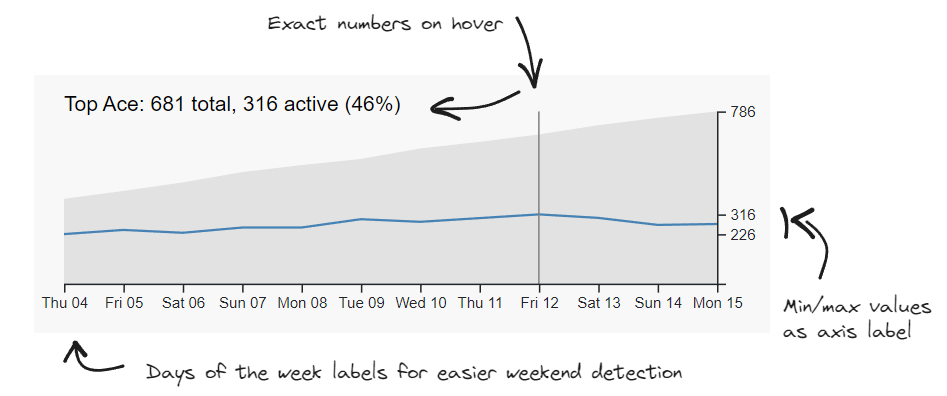
Since I like to add a bit of interactivity and I am aware of the information overload, I opted to hide raw data behind the callout that is shown on hover. To better understand that the chart is interactive, I added the vertical line signalizing the callout date to strike the reader into eyes when they randomly move cursor in the area.
I bit of extra detail is reducing the Y-axis tick labels, because I don't want readers to struggle with trying to read the exact numbers off the chart (they have hover callout for that). Instead of common increments of 100, I went with deliberately showing tics with some meaning - minimum value of daily active players, maximum value of daily active players and maximum value of total players. This conveys an extra useful information on the spread of values.
The last quirk is that I have drawn dates in a bit uncommon format of Day-of-the-week Day (Fri 12). I did this because of the limited timeframe within a single month and with potentially interesting patterns of activity on weekends. Reader can easily identify weekends with this, with not much of a tradeoff.
Unit pick rates
Decks in Battle Aces consist of 8 units that are further divided into 5 tech groups - Core (2x), Foundry (1-2x), Advanced Foundry (1-2x), Starforge (1-2x), Advanced Starforge (1-2x). I wanted to first observe the pickrates of individual units rather than looking into units that are picked together.
Queries
I have used and extra file with unit definitions units that contained the translation of unit codes to the names slug and the tech category techTierSlug.
The idea remained similar to the previous effort. Select the records with notable activity and assume that the deck provided in the record was the one used during the hour-long sessions.
WITH dat AS(
SELECT date, slug, techTierSlug
FROM(
    SELECT UNNEST(units[:]) AS unitId, datetrunc('day',timestamp) AS date
    FROM(
        SELECT name, units, timestamp,
            (LAG(rating, 1)OVER(PARTITION BY name ORDER BY timestamp) - rating <> 0) AS active
        FROM leaderboard1v1
        ORDER BY timestamp
    )
    WHERE active = TRUE
    AND timestamp < '2024-07-16'
)l JOIN units u ON l.unitId = u.unitId
),
...
The first CTE uses UNNEST to explode the array of units into individual records and assign the labels to be used later for grouping operations.
histo AS(
SELECT date, slug, techTierSlug, count(*) AS c
FROM dat
GROUP BY date, slug, techTierSlug
ORDER BY date, slug, techTierSlug
),
dayCounts AS(
SELECT date, count(*)/8 AS c
FROM dat
GROUP BY date
)
SELECT h.date, h.slug, h.techTierSlug, h.c, h.c/d.c AS perc
FROM histo h JOIN dayCounts d ON h.date = d.date
ORDER BY h.date,h.slug
;
CTE dayCounts might look a bit tricky at first, but it is just a helper to calculate the percentage perc pickrate of the individual unit. Since I have used the UNNEST operation on a column containing 8-unit arrays, I have gotten 8 rows for each active player in the given hour. Dividing by 8 just returns the correct number of decks or players respectively.
Visualization
Once again I wanted to go for a fancy interactive chart. This enabled me to use line chart to draw all the units in a category (up to 12 lines) with muted color and only highlight 1-2 lines of interest. This way the reader isn't overwhelmed with the spaghetti of lines and can focus on shape of a single unit and compare it to the unlabeled rest of lines.
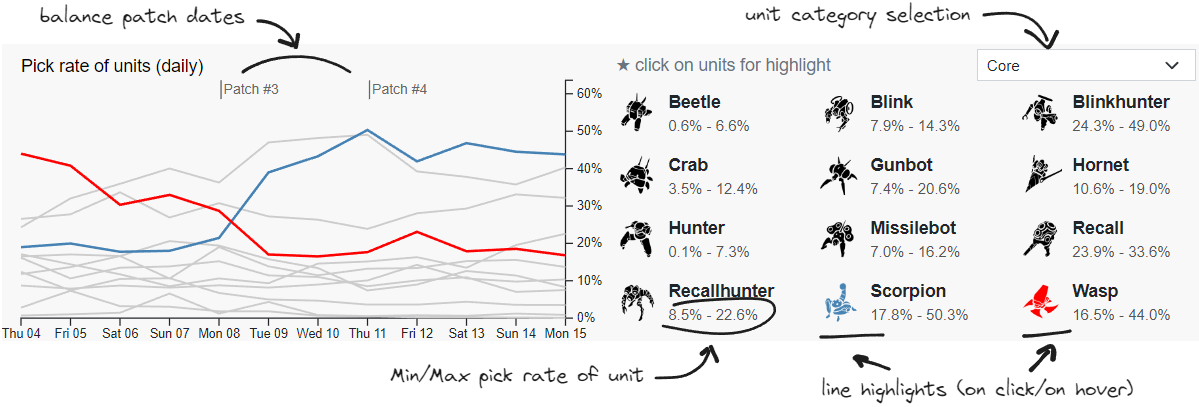
I considered the information about patch days relevant to the topic, so I added a vertical tick above the chart to signalize the patch day. I preferred this solution over drawing the entire line (since it would clutter the chart) or changing background color for particular patch periods (since it would be hard to find fitting color in my mostly grey pallette, that wouldn't be too distracting).
The right side of the visual is a bit more complex as it serves a role as a control panel and also provides more detailed stats. Reader can switch between tech groups via the dropdown. After switching, the most picked unit on the last day of playtest is automatically highlighted.
Beneath the picker, there is a list of units in the group. Reader can hover over the units to temporarily highlight the line, or they can click the unit to permanently highlight it (only one permanent highlight at a time). This way they can compare two units of interest.
There are also numbers in muted color providing insight on minimum and maximum pick rates of the unit, since that is an information some might seek and would be hard to interpret from the lines. Especially if the unit is niche with low pick rates and there are multiple lines overlapping.
I have made the visual dynamic, so I could update it when the reader hovers over active words in the text of the report - i.e. when I mention a unit name, they can quickly see the pickrate if they want to.
Double tier 3 unit picks
The last piece of report is about the wildcard slot in decks. Players have to choose to add one Starforge (tier 2) or Advanced Starforge (tier 3) unit and one Foundry (tier 2) or Advanced Foundry (tier 3) unit. The premise was to see if there is some preference between picking units of lower tiers which are available earlier in match, or have an additional late game unit available.
Queries
The first step was to find the percentage of decks having a tier 3 unit as the wildcard.
WITH dat AS(
SELECT *
FROM(
    SELECT units[7] AS wildFoundry, units[8] AS wildStarforge, timestamp, datetrunc('day',timestamp) AS date
    FROM(
        SELECT units, timestamp,
            (LAG(rating, 1)OVER(PARTITION BY name ORDER BY timestamp) - rating <> 0) AS active
        FROM leaderboard1v1
        ORDER BY timestamp
    )
    WHERE active = TRUE
    AND timestamp < '2024-07-16'
)
)
SELECT date,
SUM(CASE WHEN u1.techTierSlug = 'foundry' THEN 1 ELSE 0 END) AS foundry,
SUM(CASE WHEN u1.techTierSlug = 'advancedfoundry' THEN 1 ELSE 0 END) AS advancedfoundry,
SUM(CASE WHEN u2.techTierSlug = 'starforge' THEN 1 ELSE 0 END) AS starforge,
SUM(CASE WHEN u2.techTierSlug = 'advancedstarforge' THEN 1 ELSE 0 END) AS advancedstarforge,
COUNT(*) AS c,
foundry/c AS foundryPerc,
starforge/c AS starforgePerc,
FROM dat d
    JOIN units u1 ON d.wildFoundry = u1.unitId
    JOIN units u2 ON d.wildStarforge = u2.unitId
GROUP BY date
;
The query utilizes the fact, that units are ordered in the array by the slot represented in game, thus [7] and [8] are the wildcards in question. Using the units table, I check whether the units are from tier 2 or tier 3 and sum the occurences.
To gain more insights on the unit combinations when playing double T3, I used additional query to list the popularity of the combinations.
WITH dat AS(
SELECT *
FROM(
    SELECT units[6] AS advStarforge, units[8] AS wildStarforge, datetrunc('day',timestamp) AS date
    FROM(
        SELECT units, timestamp,
            (LAG(rating, 1)OVER(PARTITION BY name ORDER BY "timestamp") - rating <> 0) AS active
        FROM leaderboard1v1
        ORDER BY timestamp
    )
    WHERE active = TRUE
    AND timestamp < '2024-07-16'
)
)
SELECT date,
CASE WHEN u1.slug < u2.slug THEN u1.slug ELSE u2.slug END AS unit1,
CASE WHEN u1.slug < u2.slug THEN u2.slug ELSE u1.slug END AS unit2,
COUNT(*) AS count
FROM dat d
    JOIN units u1 ON d.advStarforge = u1.unitId
    JOIN units u2 ON d.wildStarforge = u2.unitId
WHERE u2.techtierSlug = 'advancedstarforge'
GROUP BY 1, 2, 3
ORDER BY 1, 4 DESC
;
The trick is in filtering by advancedstarforge for the wildcard slot, thus only considering the double T3 combos. Another trick was to sort the units alphabetically, so I could group the combinations and not have to worry about the order of the units in the deck. Technically, player could swap the unit in wildcard and normal slot and they would still be playing the same deck.
T3 combinations for foundry tech were done in a similar manner - changing the array indices and filtering by advancedfoundry.
Visualization
I went with a table this time, trying to show the interesting numbers in a compact form. The idea was to combine the two previously gathered insights while keeping it readable.
I was thinking about other compositions and chart types, but didn't really find a way to communicate the changes in popular unit combos.
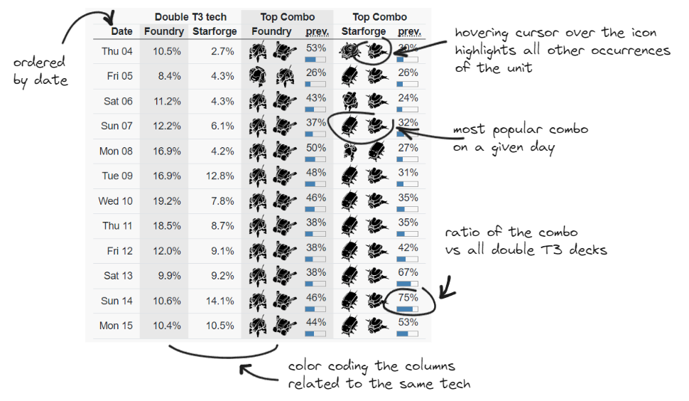
The table is sorted by date, each day being a separate row. The second and third column gives a percentage of decks that used wildcard for an extra T3 unit in a given tech group. I decided to clump these columns together since readers might want to compare the two.
The right side of the table consist of the most popular combination of the T3 units on a given day. I used icons to represent the units to keep it consistent with previous visual and possibly making it easier to parse (compared to writing out the unit name).
I tried to color code the columns representing foundry and starforge tech to make it easier to skip eyes on the related metric on the other side of the table.
I also added an option to highlight a single unit to easily spot where else it has been featured in the table. This way someone can for example observe that katbus have been in all top combos apart from two days even though katbus icons are sometimes drawn in the 1st and sometimes in the 2nd combo slot due to alphabetical ordering.
I was a bit worried about communicating the information on how popular the combo was in regard to other combos. I decided to duplicate the info by both showing the percentage and drawing a simple inline gauge bar beneath to better communicate it in a visual way. This way it should feel as different type of metric compared to the percentages on the left side.
Other explored ideas
I have considered mining association rules to find relations such as if I have unit X in the deck, I am more likely to have unit Y. There were plenty of rules with good metrics, but I couldn't really find a way to interpret them in a meaningful way without resorting to just list them out.
I also wanted to check for entire deck popularity, but I have found out there were many unique decks and the incidence of the same deck was very low. I could have tried to cluster the decks to determine some sort of meta labels, but I didn't think it would lead to interesting insights given the time commitment needed.
Conclusion
In short, it was nice to see that even with little data one can actually derive interesting insights. I wish that the team behind the game would eventually make more data available or at least include proper player IDs and some W/L stats to make the process less messy and error-prone.