Analyzing StormGate 2024-02 playtest.
Technical post about the process of making the report for the StormGate Elephant beta stage.
This post references Stormgate 2024-02 Playtest Observations.
As a primarily competitive 1v1 player, I was interested to see a bit more into details on how matchmaking works in Stormgate and how does the game population look like. Since there has been a collaboration of the gamedev team (Frost Giant) with web developers The Casuals to create a public API and a stats website, I took that as an opportunity to use the data to make some potentially interesting observations.
My questions of interest were
- How good is the matchmaking system?
- Is the population locked into geographical regions?
- Is there a preference in the factions (Infernal, Vanguard) played by players?
I was also interested in seeing how do Ranking Points (RP) correlate with Matchmaking Rating (MMR) and which of them should be used to compare players' performance, but there were no usable data available for that.
Data Collection
Data collection was rather straightforward in this project. StormgateWorld API provided two key endpoints - /v0/matches containing information on most of the matches played and /v0/leaderboards/ranked_1v1/dump containing dump of the entire leaderboard. Matches were crawled page by page at the end of the playtest period.
Matches attributes
Notable attributes provided for each match were:
server- location of the game server hosting the matchcreated_at- timestamp of the match startstate- whether the match has been completedplayers.N.player.player_id- key that could be used to link to the leaderboardplayers.N.mmr- Matchmaking Rating of the playerplayers.N.mmr_diff- Matchmaking Rating change due to match resultplayers.N.race- faction pickedplayers.N.result- match resultplayers.N.ping- ping of the player
Most of these were also shown in the views provided on the web player profiles, so it was easy to intuitively verify the data by simply checkin after the played match.
The only issue was at the start of Steam Next Fest when there were issues due to heavy load of the servers and some matches were not recorded, or they stayed in an ongoing state.
The only questionable field was the ping. It is not clear if it is some sort of aggregate, the value at the start of the game or some arbitrary value. I just assumed it is a number that reasonably correlates with the latency of the player throughout the game.
Leaderboard attributes
I used the data mainly to get the final rank of all players (by RP) and to get their total number of games per faction.
Again, since the leaderboard was available on the web and plenty of other players were checking it during the playtest, I have high confidence in the data being correct.
Data wrangling
I used DuckDB to store the data and some Python to help with the data manipulation.
Mirroring the match record
I have done a bit of data enhancement on matches table to make the analysis easier. I have duplicated all the rows and switched the player1 and player2 data columns to make the data symmetrical. This way I can consider player1 represents the "player of interest" and player2 data is "the opponent". I believe this form is more intuitive in this context.
| id | server | P1 | P1-result | P1-fact | P1-mmr | P2 | P2-result | P2-fact | P2-mmr |
|---|---|---|---|---|---|---|---|---|---|
| 0taeBo | Los_Angeles | bJvyLF | win | infernals | 1086.7595 | r4yjAc | loss | vanguard | 1133.7717 |
| 0taeBo-r | Los_Angeles | r4yjAc | loss | vanguard | 1133.7717 | bJvyLF | win | infernals | 1086.7595 |
| u2gF2R | Frankfurt | CFY5gy | loss | infernals | 1466.5575 | kO7xN4 | win | vanguard | 1521.7434 |
| u2gF2R-r | Frankfurt | kO7xN4 | win | vanguard | 1521.7434 | CFY5gy | loss | infernals | 1466.5575 |
⮙ Example of the mirrored match record (abridged). Note that lines 2 and 4 contain mirrored data of line 1 and 3, respectively.
Calculating reference date
The other issue is that I intend to do date-based analysis, so I need a rule on how to convert datetime to reference date. The decision on when the day changes is not trivial. Due to the global nature of the game, there is always a timezone that would have their prime gametime cut into two days.
SELECT HOUR((strptime(created_at, '%Y-%m-%dT%H:%M:%S'))) AS h, count(*)
FROM matches
WHERE created_at > '2024-02-14' AND created_at < '2024-02-21'
GROUP BY 1
;
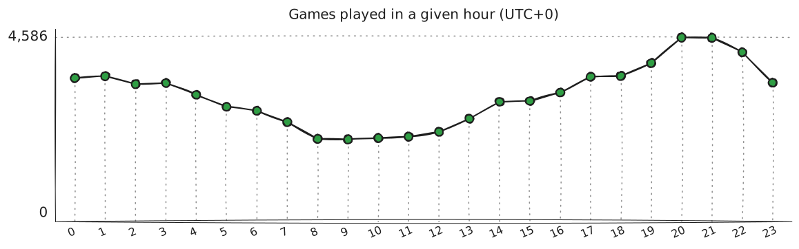
⮙ Distribution of games played by hour of the day.
Doing a quick analysis, my intuition of 8-10 UTC being the least active hours due to them being late night in Americas and early morning in Europe was confirmed. I have thus decided to use 08:00 UTC as the cutoff.
refdate DATE AS (strptime(created_at, '%Y-%m-%dT%H:%M:%S') - INTERVAL 8 HOUR)
Deriving ELO parameters and implied winchance
I needed a way to determine the system ELO parameters to be able to use implied winchance and to see the convergence of the MMR to the true skill. Assuming the underlying system is ELO based, I used the following formula to estimate the 2 parameters.
from scipy.optimize import curve_fit

def expected_win(rating_diff, D):
    return 1 / (1 + 10**(-rating_diff / D))

# Objective function for curve fitting, for win scenario
def win_change_obj(rating_diff, K, D):
    return K * (1 - expected_win(rating_diff, D))

# Curve fitting for win_change
params_win, _ = curve_fit(win_change_obj, win_df["rating_diff"], win_df["win_change"], p0=initial_guess)
⮙ Snippet of the Python code used to estimate the ELO parameters.
I was aware of the fact there is a scaling factor for newer accounts, so I deliberately only picked the matches that were played by players that had 75 games played at that point to eliminate this factor. The cutoff came after observing the behavior of MMR gains in even matches (both players having similar MMR) based on the number of games played by the player. This chart shows the 5-95 percentile band of gains, and it's convergence after around 60th game played.
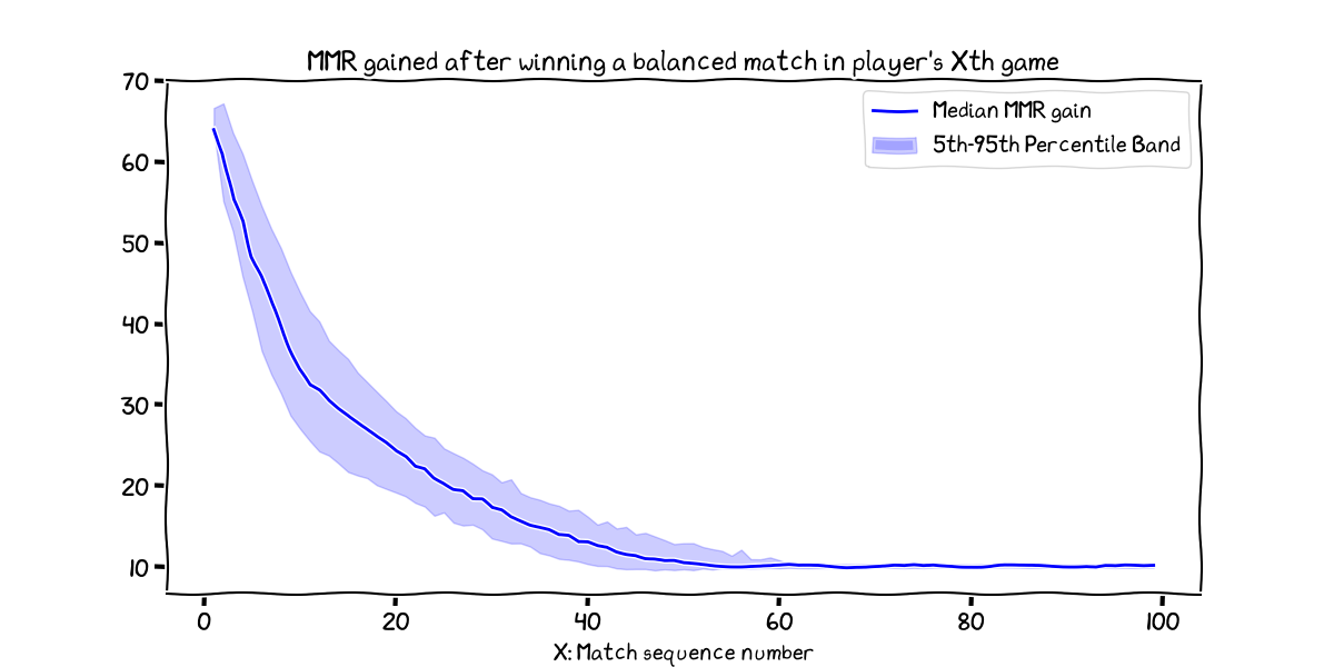 ⮙ Note, the number of games grouped in each X tick is decreasing rapidly (max count is 18811 for X=1; min count is 14 for X=98)
I filtered the data used in estimating the ELO parameters and in drawing the previous chart by the SQL query utilizing a window function. That way it was pretty straightforward to just make a Dataframe. There has been a bit of dealing with weird datapoints, when some matches did not have the result recorded, or the MMR change was missing.
WITH stabilized_matches AS(
	SELECT match_id, created_at, player1_id, player1_race, player1_result, player2_id, player2_result, mmr_diff, player1_mmr_diff,
	RANK()OVER(PARTITION BY player1_id, player1_race ORDER BY created_at) AS player1_gamenum,
	RANK()OVER(PARTITION BY player2_id, player2_race ORDER BY created_at) AS player2_gamenum
	FROM matches
	WHERE player1_result IN ('win', 'loss')
)

SELECT
    player1_gamenum,
    player1_mmr_diff AS win_change
FROM stabilized_matches
WHERE ABS(mmr_diff) < 1
    AND player1_result = 'win'
    AND ABS(player1_gamenum-player2_gamenum) <= 5
;

SELECT
    mmr_diff AS rating_diff,
    player1_mmr_diff AS win_change
FROM stabilized_matches
WHERE player1_gamenum > 75
    AND player2_gamenum > 75
    AND player1_result = 'win'
    AND mmr_diff IS NOT NULL
    AND player1_mmr_diff IS NOT NULL
;
The resulting ELO parameters were (20.485, 422.491) when fitting for game wins and (20.412 416.020) when fitting the game losses. These results are a bit weird, since (I) intuitively the gains and losses should be symmetrical and thus the parameters should be the same in both cases, and (II) the parameters are a bit higher than the arguable nice default ELO configuration (K=20, D=400). It might be, that the system is not purely ELO based, or that the data is not clean enough to make a good fit, or that tha developers were a bit of a troll and used some weird parameters.
Since we have the estimated system parameters (post-estimated from the two estimate to 20.45, 420), I have added implied winchance and expected MMR change columns to the matches table.
expected_win DOUBLE AS CAST(round((1 / (1 + (10 ^ (-(mmr_diff) / 420)))), 4) AS DOUBLE)
mmr_change DOUBLE AS CAST(CASE
             WHEN ((player1_result = 'win')) THEN (round((20.45 * (1 - expected_win)), 4))
             WHEN ((player1_result = 'loss')) THEN (round((-20.45 * expected_win), 4))
             ELSE 0 END AS DOUBLE)
Analytics and visualizations
Based on the questions of interest, the key attributes to work with were server, mmr and ping. I used a PowerBI Desktop model to quickly explore different views to find interesting patterns to work with. The final visualization has been done in D3.js to easily embedd it into a web report.
I decided to go with larger number of simple CSV data exports that would be merged into individual visualizations in the final report. Since the underlying data would not change, the exports were serialized as tables in DuckDB rather than views to save time on potential re-runs of complicated queries.
Matchmaking quality
The basic idea was to provide an overview of the activity in matchmaking mode (1v1) in a sense of number of conducted matches grouped by MMR and day. The viz would be enhanced by having a animated/play sequence to show the evolution of the distribution over time. There would be also additional subcharts showing the quantiles of the MMR distribution and two qualitative metrics - the difference in MMR between players in a match and difference in their ping.
MMR distribution
This has been pretty straightforward to do, with only decision being the width of MMR bins (since mmr is technically real value and even as integers the number of columns in histogram would be too high ~1400). I went with arbitrary 25 MMR bins which is more of a nice number (1/4 of 100) than a data-driven decision. The main consideration was picking the width large enough so the initial value of 1500 MMR for new accounts would not be too dominant in the chart (it still is).
CREATE TABLE T_matches_per_day_mmr25 AS
SELECT refdate, CAST(FLOOR(player1_mmr/25)*25 AS INTEGER) AS bin25, count() AS c
FROM matches
GROUP BY refdate, bin25
ORDER BY refdate, bin25
MMR quantiles
Quantile tickers were intended to make observing the change in the distribution easier. I went with 25th, 50th, 75th, 90th and 95th percentiles. They are purposely asymmetric because players tend to be active more in the higher MMR range and thus the right tail is more interesting.
CREATE TABLE T_per_day_mmr_quantiles AS
SELECT refdate,
    quantile(player1_mmr, 0.25) AS q25,
    quantile(player1_mmr, 0.5) AS q50,
    quantile(player1_mmr, 0.75) AS q75,
    quantile(player1_mmr, 0.90) AS q90,
    quantile(player1_mmr, 0.95) AS q95,
FROM matches
GROUP BY refdate
ORDER BY refdate
⮙ DuckDB has a convenient quantile function that makes this calculation easy.
The quantiles have been drawn as a vertical line and label indicating the value in reference to X axis of the main chart. I was considering using background shading in the histogram to show this information, but that felt too busy. Similarly, drawing the lines through the chart was also avoided. This left me with two options – drawing secondary horizontal axis above the histogram to use as a reference for the quartiles, or drawing minimalist tickers near the original X axis. I went with the latter simply to save space for animation controls and reference date metadata in the top part of the chart.
MMR difference, ping difference
The first of the crafted quality metrics was quite simple – matchmaking systems generally tries to pair players of similar skill. This is represented by their respective MMR numbers. By calculating diff between the two players in a match, we can get an objective measure of how well the system is doing and derive an implied winchance from it.
To visualize the quality, I took a liberty to define what would be considered a good match and I categorized the matches into 5 groups of 0-50, 50-100, 100-200, 200-400, 400+ with the lower values being desirable. The thresholds were once again chosen to be nice numbers most importantly. They translate to implied winchances (from the perspective of worse player) of >0.43, >0.37, >0.25, >0.1 and <0.1 respectively.
CREATE TABLE T_per_day_quality_mmr AS
WITH calc AS(
    SELECT refdate, quality, COUNT() AS c
    FROM matches m JOIN d_mmrdiff d ON ABS(m.mmr_diff) >= d.low AND ABS(m.mmr_diff) < d.high
    GROUP BY refdate, d.quality
)
PIVOT calc
ON quality
USING sum(c)
GROUP BY refdate
ORDER BY refdate
⮙ d_mmrdiff contains the thresholds and quality labels. PIVOT is a convenient way to make the table wide for the visualization, so that a single row contains all the data for a single day.
The second metric was the ping difference. It was calculated by the same principle with thresholds 0-25, 25-50, 50-75, 75-100, 100+ ms. Since the majority of players had pings in 20-39 range, even the 50+ difference could be considered catastrophic. However, using the common ping ranges in related RTS games, I decided to scale the thresholds more generously.
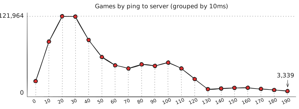
⮙ Distribution of player pings to the game server. Not shown: 4757 data points distributed in range 199-965 ms.
Crafting the Visualization
I wanted a web based visualization for ease of sharing and since I wanted to make a complex set of linked charts I went with D3.js, which is flexible and powerful library at a cost of being a bit more complicated and messy to use.
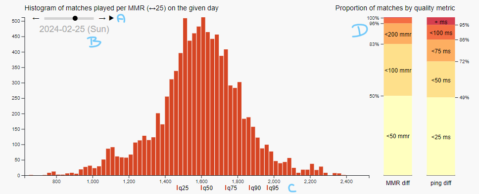
Apart from the central histogram of matches played, there are quite a few additional elements and information incorporated.
- (A) is the control for the animation. Reader can choose to play the sequence of daily charts chronologically or to manually step through them.
- (B) gives a reference date with a day of a week mentioned since there has been an established pattern of higher activity on weekends. There is also a (currently hidden) label for Steam Next Fest, which was a period of time when anyone can try the game out and thus the activity has been heavily increased.
- (C) quantiles as discussed earlier
- (D) quality metrics with explicitly mentioned percentiles of thresholds that are linked to the currently viewed date.
Implementation was pretty straightforward in general - each component has been drawn by a separate function with a selected date as an argument. The wrapper function has read the actual position on the slider, deduced the date from that and called the functions.
Since I did not use native slider element (mainly because of issues with embedding active HTML element into an SVG), I had to manually craft the tech. In the end the feel is worse than with the native slider, but it is still usable. The main issue is that I didn't manage to satisfactory implement the behavior of clicking into slider to move the handle in that direction. I settled with extra button like elements that increment/decrement the slider position by one day. Also, the mouse action area seems to be a bit smaller than on the native slider.
Another issue that I have left unsolved is overlapping labels on histogram quantiles and on the ticks of quality metrics. Quantile marks could probably have the texts removed if I communicated the meaning of the ticks in other way. I did not find a good way to do that though and since there is possibility of the chart being photoed without explanatory text I decided to keep the labels in. The ticks on quality metrics are left because I use them to communicate the exact value.
Worth mentioning is the color palette chosen. I should have probably consulted an artist since I am not really proficient in this area, but due to the time constraint I had to do my best. I tried picking a dominant color from a Stormgate promo art (to hopefully visually connect with the game). The rest of colors were picked from a random online palette generator. Since I basically had a 5 stage grading for the qualitative metrics, I went with a monochromatic palette with a gradient of the main color. The brightest of the gradient looks a bit weird on the background, but I wanted to keep the gradient sharp to make the difference easily perceivable. I have tried providing a thin border around the column to fight the issue, but then the metrics charts felt way too dominant and attention grabbing even though they had a supplementary role.
Geographical distribution
The matchmaking placed matched players onto one of the 11 servers. Players/accounts were not bound to a single server, but they could be matched anywhere as long as the ping was acceptable.
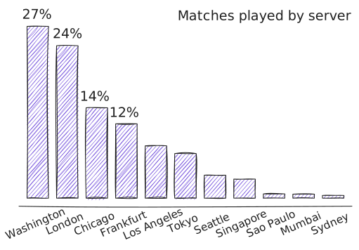
⮙ Distribution of all matches played during the playtest period by the server location. Utilization of the servers is not uniform, European and Central/Eastern US servers are the most active.
I wanted to focus on situation in the top of the ladder where matchmaker might be strained to find a good match both in terms of MMR and ping. I selected top 100 players by RP at the end of playtest period. I did not deal with players having multiple accounts, simply due to it being a marginal issue that is complicated to solve properly and completely.
Number of servers visited by top players
The first interesting metric was the number of servers that players have played on.
WITH top100 AS(
	SELECT DISTINCT player_id
	FROM stats st
	WHERE refdate = (SELECT MAX(refdate) FROM stats)
	  AND st.rank <= 100
),
top_matches AS(
	SELECT t1.player_id, m.server
	FROM matches m JOIN top100 t1 ON m.player1_id = t1.player_id
	  JOIN top100 t2 ON  m.player2_id = t2.player_id
),
SELECT player_id, COUNT(DISTINCT server) AS servers, histogram(server) AS histo
FROM top_matches
GROUP BY player_id
The query identifies the top 100 players based on the last day rank and filters out the matches between players in this group. The matches could be played at any time, even when the players have not reached the top 100 yet, which could influence the server distribution, but it does not play a role when looking on number of distinct servers visited.
The most frequent values for servers visited by player were 4, 5 and 7 (with similar counts), which was a bit surprising as I was expecting lower numbers in general.
Degree of separation between top players
Another explored analytical avenue was looking at players' opponents as a network. Technically, I was interested whether the network is connected or not. The major concern with a single global ladder is the propagation of MMR between regions. If the network is connected, it can be argued that the MMR of a player based in EU can be comparable with an Asia based player even if they cannot be matched directly. There is a systematic balance mechanism (~ zero transportation costs economy model) that should keep the MMRs in check with enough games played.
To calculate the situation, I have collected number of matches played between each of the top 100 players in a form of a matrix. The matrix has been converted to a 0/1 neighborhood matrix and utilizing Floyd-Warshall algorithm I have calculated the shortest path between each pair of players.
The findings were rather optimistic for the matchmaking system. The network was connected with ~49% of player pairs being directly connected and ~51% of pairs being connected through a single intermediary. Only 8 pairs had to be connected through 2 intermediaries.
※ The numbers are a bit skewed - player having multiple accounts in top 100 cannot by definition be matched directly with themselves, so they will always have at least one intermediary. Similarly, the rating has been actually differentiated between two playable races, so the same account could be in top 100 with two different ratings and once again generating a connection through an intermediary.
Vizualizing the opponents of top players
The relationship between players has been also visually presented. Since 100 nodes with dense connections would look like a mess, I tried to craft a more intuitive visualization. The idea has been to cluster the players by their region and only draw the connections for a single player after interaction with the chart. This would provide a viz with some basic information about the player regional distribution without any need for user interaction. If the user was interested, they could go more in detail and try to explore the individual connections.
I needed a way to determine the players' region. I could technically ask the players since most of them were active in the community, but I decided to go with a more data-driven approach.
WITH servers AS(
	SELECT player_id,
	       arg_min(server, ping_median) AS home_server
	FROM (
		SELECT player1_id AS player_id,
		       server,
		       median(player1_ping) AS ping_median,
		       min(player1_ping) AS ping_min,
		FROM matches m
		GROUP BY player1_id, server
		HAVING COUNT(*) >= 3
		)
	GROUP BY player_id
)
I have gathered all the matches the player played and calculated the median and minimum ping to each server they played on. I have noticed there were weird outliers that was obviously wrong, but it was hard to properly clean them. Thus, I decided to:
- move away from using the minimum ping and instead use the median ping as the metric to be minimized;
- only consider servers with at least 3 matches played on them.
That reduced all (from what I could notice by eye) outlier issues. The home server map was provided as one of the inputs to the visualization together with games played between the player pairs.
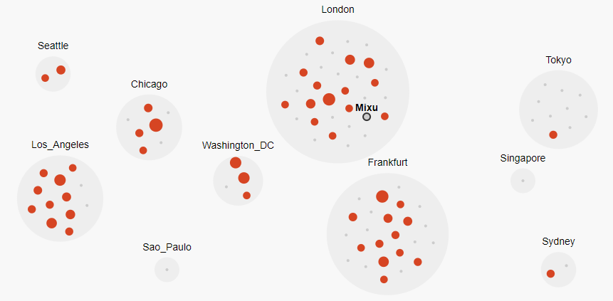 ⮙ Visualization after hovering mouse above node representing Mixu. Red marks are encountered opponents, grey marks are other top 100 players. Red marks size corresponds to number of games. The viz has optical clusters by home regions as discussed above. The viz also serves to show the regional distribution of top 100 players.
I was contemplating whether to show all the player names, but decided against it because it created optical clutter. The texts were overlapping the node icons (which is also an issue in the current version with the only one player name being shown) and the general information of how many of the regional players were encountered was not immediately readable.
There should probably be a way to find a player easier than just hovering cursor above the individual nodes. The most straightforward would be probably a search bar in the corner, or a dropdown list. I have not implemented this feature due to time constraints and this being a lower priority that would not provide that much more insight.
I have also decided against drawing the edges as lines, which is common in network visualizations. I wanted to keep the readability high and thought that using color and dynamically changed node sizes could be enough to communicate the relation.
The last bit I would change is the styling the clusters. Currently, their positions are hardcoded, so they resemble the geographical relative positions. However since the cluster size is dynamic, there might be overlaps or weird placements with different data. The labels could also use a bit more stylistic touch - maybe fitting them on a curve to better follow the shape?
Faction popularity
Data wrangling
The last question of interest was the faction popularity. I approached it by looking whether the players had a preference for one of the factions. This was more of a data wrangling exercise rather than a complex analysis.
Since I have already dealt with the top 100 players cohort and there was also an interesting group of players that played only in the open week of Steam Next Fest, I incorporated these groupings.
WITH calc_stats AS(
	SELECT player1_id, MIN(refdate) AS date_min,  MAX(refdate) AS date_max
	FROM matches
	GROUP BY player1_id
),
top100 AS(
	SELECT DISTINCT player_id
	FROM stats st
	WHERE refdate = (SELECT MAX(refdate) FROM stats)
	  AND st.rank <= 100
),
pivoted AS(
	PIVOT stats
	ON race
	USING sum(wins+losses)
	GROUP BY player_id
)
...
These were the preliminary SQL queries to gather data to determine:
- the timespan the player has been active to estimate, whether it is a Steam Next Fest player or a regular beta tester;
- the top 100 players list;
- pivoted table with the number of games played per player (row) and faction (column)
SELECT *,
    COALESCE(infernals,0) + COALESCE(vanguard,0) AS games,
    COALESCE(CASE WHEN infernals > vanguard THEN infernals/games ELSE vanguard/games END, 1) AS perc,
    (COALESCE(infernals,0)/games) AS perc_inf,
    (COALESCE(vanguard,0)/games) AS perc_vg,
    CASE WHEN t.player_id IS NOT NULL THEN 1 ELSE 0 END AS top100,
    CASE WHEN s.date_min < '2024-02-05' OR s.date_max > '2024-02-12' THEN 0 ELSE 1 END AS nextfest
FROM pivoted p
    LEFT JOIN top100 t ON p.player_id = t.player_id
    LEFT JOIN calc_stats s ON p.player_id = s.player1_id
WHERE games > 0
;
The rest of query seems a bit complicated, but it is mainly due to dealing with nulls. The resulting table contains information about the players, number of games, percentage of games being their main faction, percentage of games being Infernal and Vanguard, flags whether they are in top 100 and whether they are a Steam Next Fest player.
Crafting the visualization
I think these type of insights are best communicated as multiple stripe 100% stacked bar charts (similar to Linkert scale viz).
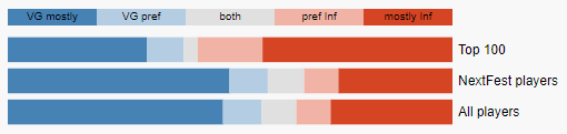
The visual contains a reference uniform distribution stripe for 5 categories - mostly played as VG, preferred to played VG, no preference, preferred to play INF, mostly played as INF. To keep with this visual clue, the actual calculations are based on the percentage ranges 0-20%, 20-40%, 40-60%, 60-80%, 80-100%.
Each of the cohort has its own stripe that could be optically compared to the reference stripe and other cohorts. This type of chart also highlights multiple facets of the data - not only whether one of the faction has more players, but also how strongly are players committed to playing only one faction.
Final remarks
There are some things missed in the analysis that I discovered later. From random tidbits on the Discord, I have come to understand that the matchmaker has been tweaked during the playtest. This could explain the "dip" in the ping chart provided as illustration above with noticeable threshold being 125 ms.
It is possible that during the temporary change of parameters and enabling the matching of players with >125 ms ping to the server, some of the players met opponents they would not face otherwise and would play on exotic servers. This could heavily influence the observations in Geographical distribution. This could also make the theory (or belief) of MMR points being globally comparable less plausible.
Some players also talked about using VPN to be able to play on different servers. This could also influence the data in the same way as the previous point, however this is not a systematic change, but a players decision to actively seek out matches on different servers.